This is the final part of a series of posts about some of lessons learned and the technical details from how I put together a visualization of passages and choices in Ryan North’s excellent chooseable path adventure, Romeo and/or Juliet. In this writeup, I share some of the code and experiements responsible for the layout and final visualization design.
Read the prior posts about book impressions, data entry and data processing as well.
Data Visualization
The visualization was created using HTML, CSS, SVG and JavaScript D3.JS libary. A key part of the D3 script is the force simulation and binding of node and edge data to SVG elements.
First we set the force simulation layout and parameters. A negative charge provides a repulsive force between each of the nodes while gravity pulls nodes to the center of the diagram. In addition to this, there is a force applied on the node links with the default settings.
var force = d3.layout.force()
        .charge(-50)
        .gravity(.175)
        .size([width, height]);
After loading the JSON data, the graph node and link data are provided to the force simulation, which will update the x and y positions of the nodes and links based upon the forces defined earlier.
force
    .nodes(graph.nodes)
    .links(graph.links)
    .start();
Using D3 we bind node data to SVG Circle elements, varying color by the passage’s POV Character and size by passage type. For user interaction with SVG element, force.drag is called.
var node = container.selectAll(".node")
        .data(graph.nodes)
        .enter().append("circle")
        .attr("class", "node")
        .attr("r", function(d) {
            if (d.is_ending) {
                return 6;
            } else if (d.id == 'Cover' || d.id == 'THE END FOR REAL THIS TIME') {
                return 12;
            } else {
                return 3;
            }
        })
        .style("fill", function(d) { return color(d.pov); })
        .call(force.drag);
Edge data is bound separately to SVG Path with a Marker arrowhead (not shown).
A function is bound to the force simulation tick event which updates the node and path positions per the latest data from the force simulation.
force.on("tick", function() {
    path.attr("d", function(d) {
        return "M" +
            d.source.x + "," +
            d.source.y + " " +
        d.target.x + "," +
            d.target.y;
    });

    node.attr("cx", function(d) { return d.x; })
        .attr("cy", function(d) { return d.y; });
});
The result of this is an awesome little interactive graph with mouse hovers and the ability to click and drag nodes. The layout of several fixed nodes to improve readability was the last thing that I worked on.
Layout Experiments
Once the force layout is configured, the data will be displayed as a tangled blob, which is randomly arrayed on the diagram. While this looked like a pretty sweet star chart, it is quite tangled and hard to interpret.
To try to make the structure of the narrative more clear, I decided to organize the graph nodes based on the order of passages visited while following the bard path. The bard path consists of red-highlighted choices that follow Shakespeare’s original version of the Romeo and Juliet story. I traversed the bard path using depth first search during pre-processing in Python and calculated a fixed layout for the bard path nodes. Nodes with fixed layout will not be subject to simulation forces. In order to add more flexibility to the layout, I only marked every 3 nodes as a fixed.
def add_bard_layout(self, layout, fixed_node=3, start='Cover',
                    end='THE END FOR REAL THIS TIME'):
    e, length = start, 0
    fixed = {e: True}
    x, y = {e: layout.x(length)}, {e: layout.y(length)}
    while e != end:
        for v in self.G[e]:
            if self.G[e][v]['bard_choice']:
                length = length + 1
                if not length % fixed_node:
                    fixed[v] = True
                    x[v] = layout.x(length)
                    y[v] = layout.y(length)

                # set next node in bard path
                e = v
                break
        else:
            print("No bard choice found for: {}".format(e))
            break
    nx.set_node_attributes(self.G, 'fixed', fixed)
    nx.set_node_attributes(self.G, 'x', x)
    nx.set_node_attributes(self.G, 'y', y)
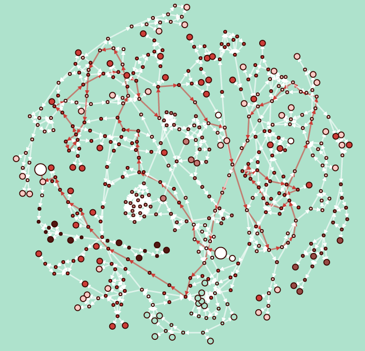
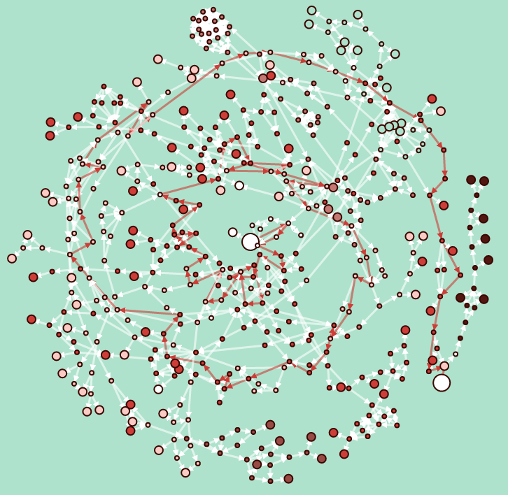
For layouts, I experimented with a couple of different possibilities. The first attempt was to use a parameterized Achemedies Spiral to fix the bard path x and y. However, this caused early nodes too close together and later nodes spread too far apart. It also caused a lot the different sections of the story to overlap, making it hard to read.
I then tried a simple circle, which provided much more space for clusters of side plots to spread out and made it more clear when the story was looping back on itself or continuing on the same general path.
Just for fun, I tried a linear layout as well, just a simple diagonal line. This looked kind of cool too, but still a little cramped.
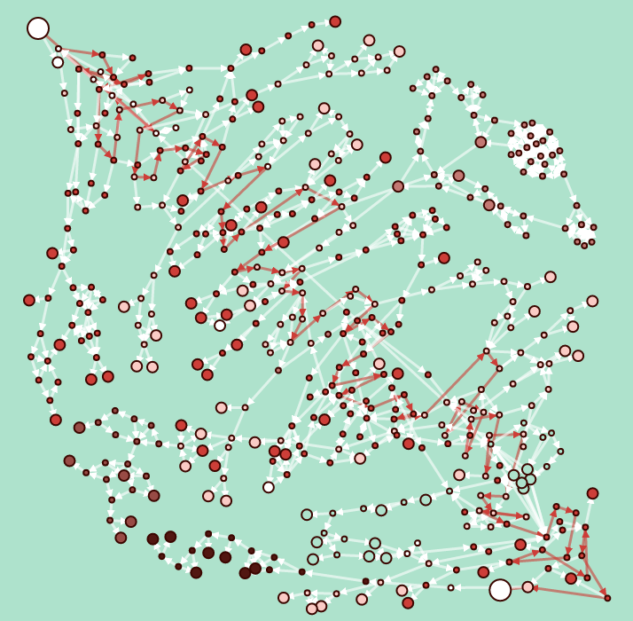
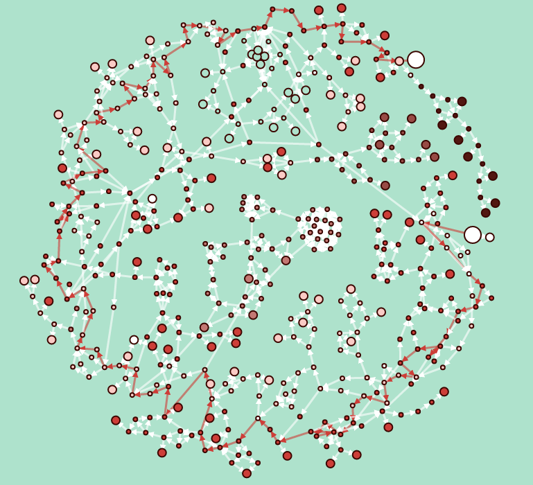
Overall, the circle layout was the winner for me, which you can see in the final visualization.
Future Improvements
If I were to spend some more time on this project, I have a bunch of ideas on how I would like to improve it. I’ll just leave these here as food for thought.
- Highlight passage and related choices on mouseover for more clarity.
- Provide fixed layout for bard passages in JavaScript rather than Python (separation of concerns).
- Use more declarative structure for front end code (React w/ D3).
- Use D3 v4 with modules for a more deterministic layout for nodes that aren’t fixed.
- Highlight shortest path to selected node with REST end point to fetch data from a backend service (is this cheating at the book?!?)
Hope you enjoyed this behind the scenes tour of this visualization!